
The longer I tangle, the more I believe the Zentangle Method®️ is becoming more of an art form and less of a meditative mindful experience. When in the right frame of mind, Tangling becomes not only meditative as I mindfully draw one line or curve after another, but it has become a way to come to terms with stuff in my life, especially the less than positive or happy stuff. To me, it becomes almost like prayer, but with honest reflection, and often possible sets of solutions.
Most Certified Zentangle Teachers (CZTs) feel as I do–that Zentangle should remain a meditative Method, using mindfulness in tangling, and giving the heart and spirit–and, of course, the mind and body–a bit of calm and respite in a chaotic world. Tangling helps one focus on the patterns, which later translates into focus on tasks and activities. And it is focus that this post is all about.
Today a new technique came to my mind for focusing on specific elements of a rather cluttered looking tangle. The process occurred to me as I was tangling a piece that started out as a good idea, but then became “muddied”. What I mean by that is that suddenly I could not easily discriminate one type of “leaf” from another. I was taught two ways of making elements stand out–1) thicken the outline or heavily shade the form, or 2) aura the form to make it stand out. Well, in the middle of a muddle, adding an aura is almost impossible. And if the forms are intended to have equal ‘weight’ in the design, heavily shading one causes the one next to it to melt into the background. Neither was what I wanted, and it was too late to aura. So what to do?
Let me show you the result (remember, this was a practice and not intended for sharing, so don’t laugh, please).
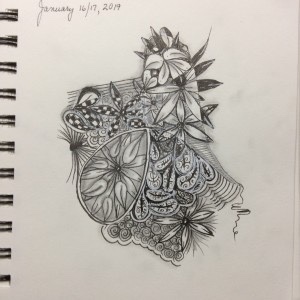
I can’t blow it up any larger, probably because I have too little space on my iPad, but even at this size, you can see each individual element–some behind others, and some simply sharing the spotlight in an area, as though each leaf were equal there. You might also notice that as borders are crossed, the petals change. They may go from white to black, or to checkerboarded, or half white and half black, or even tangled with printemps (the spiral-like figures inside leaves or outside as background. That is because my “string” divided sections into “pattern areas.” And all that is what made the work look completely cluttered and blob-like. Wish I had thought to take a Before photo, but it’s well after midnight, and I just didn’t think of it in time. But here is how I separated all the leaves without touching the overall design.
First, I outlined each leaf with a 08 Gelly Roll white gel pen. The white ink in this particular pen is opaque enough to cover black if used slowly and carefully, without a lot of pressure on the pen. In a few cases, I outlined inside the original shape to give it better visibility so it would not melt into an adjoining leaf.
After allowing the white ink to dry–it takes about a minute, but here in humid St Maarten, it could take longer, so be patient–I outlined the shapes again in black ink, as much on top or tight against the white ink. I was surprised by how much this process drew out the individual petals, especially from busy background areas.
Since black ink over white gel ink takes a while to set and dry, I waited some more.
Once I was sure the inks had dried completely, I used the graphite drawing pencil (softness 2B) to push the background where it belonged–in the back. I used a fairly heavy hand to darken the background as much as possible, taking care not to get graphite on the black portions of any leaves. Remember to use more side than point as you are doing this. Next, use a tortillion or blending stub or even a cotton swab to spread the graphite into the background and even it out.
Lastly, I shaded my petals as usual, applying graphite to the outside for depth and shadow, and to inner areas to give them dimension. Don’t get too carried away or you will create a second blob. For the most part, shade these areas as you would if you didn’t have the darker background. You will know if you need more shadow, so add several lighter coats rather than one thick and heavy coat.
And voila– a vastly improved tangled piece, with the focus back on your petals, bringing them forward by letting them stand out.
This can work whenever your items blend instead of separate. I got the inspiration for this from a book by Eni Oken’s, who has a beautiful blog and sells wonderful books on drawing techniques specific to tangling. I only have a few, but they left an impression on me that allowed me to take things a step in another direction. As you gain experience, it is amazing how your mind focuses on using techniques learned for one thing and applying them in a whole new way. My inspiration came from Eni’s book on making white seem to sparkle on black tiles.
Hope this helped.
Happy Tangling!
DrEllieCZT
