
New approach today– following are the surprises that experimenting with different types of color media can bring. Today I used the German-manufactured Coliro Pearlcolors by Finetec GmbH.

These are not inexpensive, but they are well worth the price.
Today is also a rare one for me: a day in which Tangling inspiration did not come. So I took out some new watercolors and started by making swatches on the three official colors of Zentangle tiles to see how they differ depending on background color. Most watercolors tend to have a bit of transparency to favor light. That is, they let some of the color of the paper through. The colors I used here are opaque–no paper color shows through. Yet, the colors surrounding the swatches make the paint colors look different. A small part of the reason is the pearl essence of these paints. The other, greater reason deals with how our eyes perceive color, and I am not qualified to get into that explanation. 
In this photo, taken in natural daylight, all the colors were applied to the tiles in exactly the same order. Yet, the best representation of the colors is on the black tile. If these were a clock, you can see the lilac color on the black tile at 1:00; on the other tiles, that color looks silver (on tan) or pale tan/warm gray (on white). The differences are a bit different “in person,” but not by much.
Making the swatches gave me an idea: Today I would use a few of these paints to create color areas on a tile, and then used those areas in place of a graphite string to tangle some patterns.
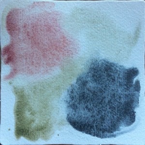
The colors here are red violet, blue silver, and blue green.
It took forever for this tile to dry, but here are the boundaries set by the colors. By the way, these pearl colors were harder to apply to the tile than when I was doing swatches. I tried to use the paint as washes rather than painted areas. For some reason, this caused the colors to gather together, like oil does on top of water. Also, I found I could use only the darker colors because of the white background almost absorbs the lighter ones and makes them invisible.
Next decision: tangle over the colors, or tangle a “broken” pattern around the colors? Well, there was very little white left on the tile, so that left tangling over the color areas, using a white gel pen over the blue silver because I suspected black ink would be invisible. Maybe brown ink would work over the blue green area.
What surprises this tile had in store for me! Nothing worked as I thought it would: the white did not show on the dark background of the blue silver at all without help from black ink; ThemMicron brown and black pens worked differently than I expected on all the colors. The pearl paint simply changed the rules on me. Result:

Black ink was needed on the silver, lightened the background colors, and softened the red violet. The beautiful green disappeared with brown ink in the upper left, leaving only a hint of green tint; but brown merely softened the background green of the lower right area; the black enhanced the outline of the red violet, but brown brought out the red and faded the violet, making the color background look more like a red wine stain.
It’s one of the things I love so much about experimenting with colors and standard media–one never knows quite how something new will turn out until one works (OK, plays) with the new. The more I play with color, the more I learn. I especially learn how little I understand color in media and on a variety of surfaces.
Play with your colors and surfaces and find your own surprises. It would be great if you shared your experiences in the comments area, including pics of your results! Zentangle, after all, is not merely for meditation or for art, but an experience to share in a safe community.
Until next time…
Happy tangling!
Dr Ellie, CZT
