For the past week or so, most of the tiles I created have been based on the earliest lessons of the Zentangle Primer, by Rick Roberts and Maria Thomas, founders of Zentangle. I was feeling overwhelmed with so many new patterns being developed, especially since I have not mastered some favorites I have come across over the past several months. When I feel overwhelmed like this, I go back to the Primer and try to work all the way through again. With each pass through the book, I am reminded of things I have forgotten, things I want to work on improving, and some important suggestions from the authors.
Today, I tangled an exercise that made me think. The purpose of the exercise was to draw a string that creates a number of areas, and then to combine some adjacent areas for tangling with a single pattern. Although I now combine areas all the time and without thinking, I forgot how difficult this was for me to do early on. Even though I have done this exercise several times since I purchased the Primer, I suddenly found deliberately combining areas difficult to do. When I tangle with no particular objective, encroaching into an adjacent area with a single tangle simply happens without my thinking about it. When I think about doing it for a purpose–such as for this exercise–I am stymied.
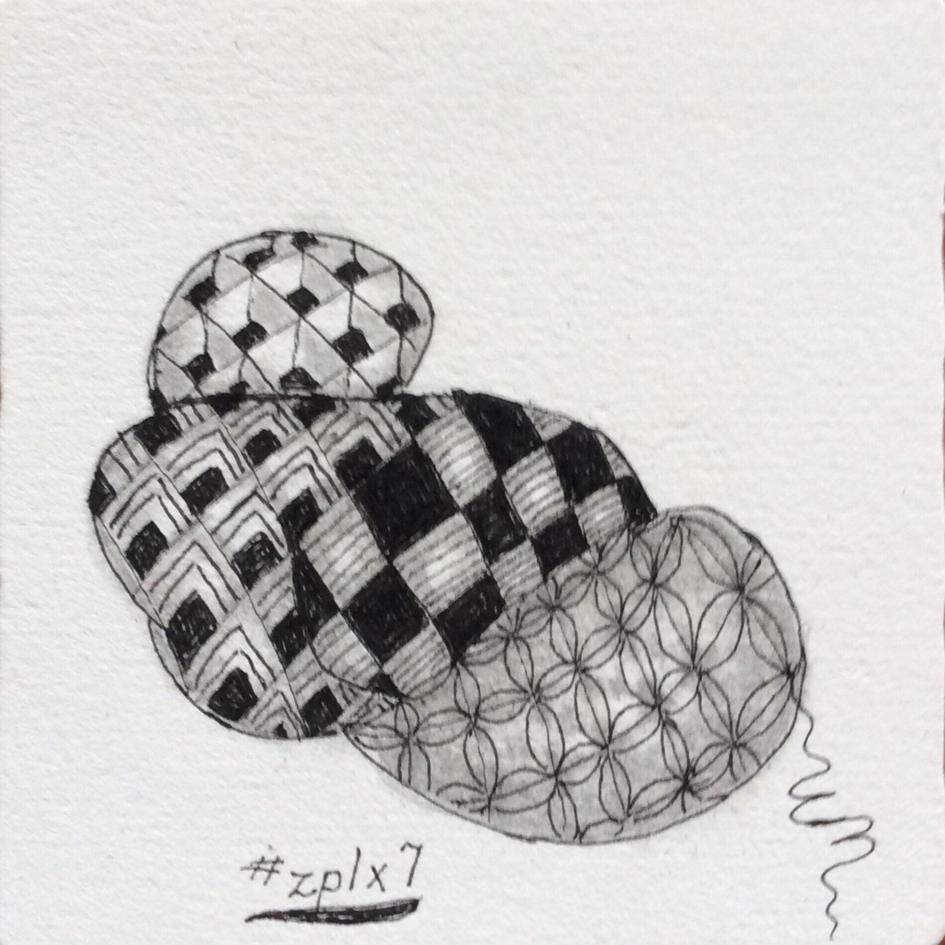
For this exercise, I used a few tangles that I learned during my first week or so of tangling, almost a year ago. Except for Florz, I don’t often use these patterns (Knights Bridge, Flukes, Cubine), in part because of the solid black areas that are part of the patterns. There are days when I have trouble staying within the limits of the dark areas because my astigmatism is particularly bad for perception. Instead of filling in areas with color, I tend to substitute fine lines that make the area darker but less dramatic than solid black. So why I chose three patterns with defined black areas is a mystery to me, except that they seemed to go together. But that is what often happens when we tangle–it’s like the pen takes over. When decisions need to be made to fulfill a purpose, pen and mind can come into conflict, and the finished tangle can look a little brittle or forced. That is what happened with this tile, I think. Forcing the blending of two areas made me anxious, and the tension showed up as a conflict among patterns rather than a free mingling.
That the realization of how I tangle was brought to the forefront of my thoughts during this exercise shows how flexible the Primer‘s lessons are for tanglers at all stages of tangling development. On the Zentangle Mosaic app, I have seen tanglers–especially CZTs (Certified Zentangle Teachers)–who have been tangling and teaching for years, fall back on lessons from the Primer. The versatility of the book is amazing. New tangles can be found all over the Internet and in books and e-books. But the basics of tangling–the method, process, and purposes–are rarely found outside of the Primer.
For me, the Primer has become an essential part of my tangling–from providing inspiration when I feel stuck, to reminding me about sticking points for my early tangling attempts and current needs. Right now, it is helping me get back to basics so I can get over feeling overwhelmed by a deluge of new patterns.
Next, I will try this exercise again using new patterns I have learned recently. There is always a new way to interpret an old lesson!
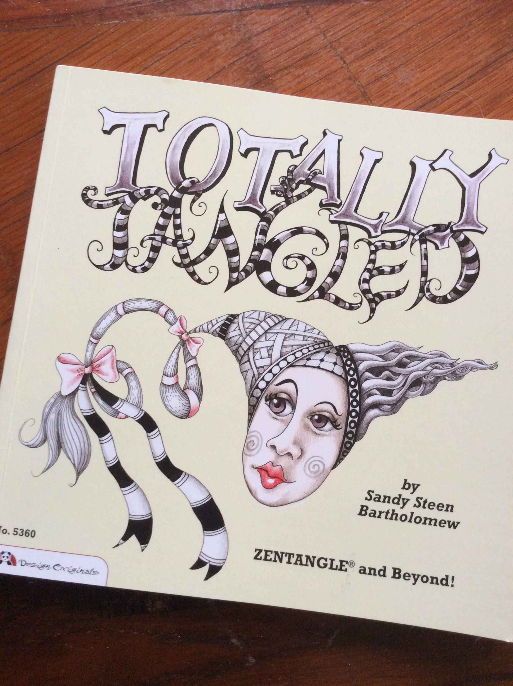
Not long ago, I talked a little about getting started with Zentangle. I had just received Yoga for Your Brain, by Sandy Steen Bartholomew and was all excited about the ideas and presentation. As always, I recommended the Zentangle Primer by Rick Roberts and Maria Thomas, Zentangle founders (available from Zentangle.com for $49.95) as the first book to get. Because it is an investment, I suggested One Zentangle a Day by BeckAh Krahula (available from Amazon.com in paperback for $13.79, or Kindle version for $12.99) as the second best option. I was waiting to receive Sandy Bartholomew’s first book on tangling, Totally Tangled, to see if it was an equal to Ms. Krahula’s book, or maybe even better. Based on the Yoga book, I was expecting a sensational introduction to Zentangle in Totally Tangled.
Totally Tangled finally arrived in our mail late last week.
Totally Tangled is a great book, filled with a lot of patterns and advice about creating tangled art. At less than $12 on Amazon, it is a great value for the ideas alone. But… Although it introduced the Zentangle Method®, there was little in the way of follow-through in terms of the ceremony or process of Zentangle. It deals very briefly with the relaxation and meditation aspects of Zentangle. The textual content tends to be an overly frugal summarization of the Zentangle Method, philosophy, and process. However, the photographs and drawings are sensational, especially to those who have absorbed much of the whole Zentangle process.
Totally Tangled came out before Yoga for Your Brain. It contains a lot of information about drawing and creating patterns, enhancing scrapbooks, repurposing old ceramics and “outgrown” household goods. It even offers some great ideas for involving children in drawing with tangle patterns. Yoga for Your Brain picks up and expands on these ideas and adds a bit more information, lots more new patterns, and several new and different project ideas. Neither volume, separately or together, comes close to the wealth of information and ideas presented in either the Zentangle Primer or One Zentangle a Day. As I stated in the previous post, if the purpose is relaxation and meditation but money is a main consideration for initial outlay, One Zentangle a Day is a great value. It costs about $2 more than either of the two Bartholomew books, and contains more information on techniques, art enhancements, and the relaxation/meditation aspects than the two Bartholomew combined.
In short, my feeling is that Totally Tangled is excellent if the primary purpose to its purchase is as an idea and inspiration book. I would recommend it as a great supplement to either the Zentangle Primer or to One Zentangle a Day, but I would not recommend it as a “first Zentangle book,” unless the reader’s main purpose for purchasing it is to freshen art or add to one’s repertoire of arts and crafts projects.
That being said, all these books contain lots of patterns and art ideas, with the Bartholomew books topping the other two in sheer volume of imagery. The artwork alone makes both Totally Tangled and Yoga for Your Brain a great investment for supplementary ideas and art inspiration, whether the art is Zentangle or more traditional art forms or crafts.
Although I had tons of official Zentangle tiles purchased from Zentangle.com, for months most of my Zentangle work was done on comparatively inexpensive 3.5-inch square tiles from Peter Pauper Press that I purchased from Amazon. I was urged to use more of the “official” tiles by other tanglers on the Zentangle Mosaic app. The reasons given ranged from “you’re worth it!” to “it’s easier to work on the Zentangle tiles,” with lots of other reasons in between.
For weeks now, I have been doing more and more tangling on the official tiles and less and less on what I now refer to as practice tiles. More and more often, I have been using the practice tiles to try out new ideas or newly learned patterns. All my meditative tangling and mastered patterns are now done on the tiles purchased from the Zentangle site.
What’s the difference? There are a lot of differences, starting with the quality of the paper and how it feels to tangle on the different surfaces.
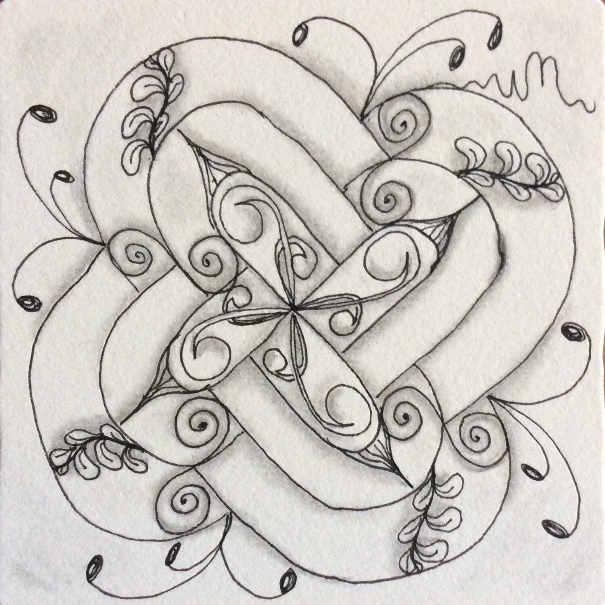
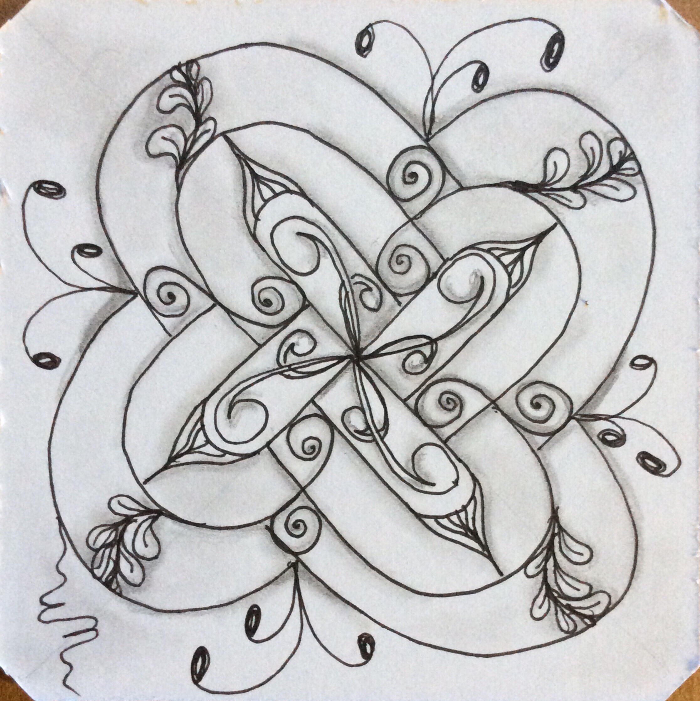
Zentangle (more expensive) tile was used for this version.PPP (less expensive) tile was used for this version.
Let me start with the price and why I did most of my work on the Peter Pauper Press tiles. The “official” Zentangle tiles cost $29 for 55 tiles from the Zentangle web site, plus postage. These can also be purchased from CZTs (Certified Zentangle Teachers). The price on Amazon for the PPP tiles is currently $5.53 for 75. Even if I didn’t have postage-free Amazon Prime benefits, the PPP tiles have a serious price advantage. The official tiles work out to about 53 cents a piece while the PPP tiles come out to less than 7.5 cents each. I get 7 of the less expensive tiles for the price of a single Zentangle tile. That’s quite a price difference! Just starting out, I felt this was a better option. I was wrong, by the way, and I will discuss why below.
Recently, in an e-book on tangling on black tiles, the author suggested that the cheaper tiles are fine for work on white tiles, suggesting that they are interchangeable. But there are a lot of reasons why this is not quite true.
As with most artist supplies, quality matters. The less expensive tiles are made from wood pulp and “post consumer products.” They are very smooth and lack absorbency, so that graphite sits on the surface while ink takes just long enough to dry that a fast tangler can smear the ink easily. Because the graphite has nothing to hold it, it is easy to accidentally rub the graphite over the surface where it is not wanted. It also takes more pressure on the pencil to leave a darker graphite line or shading. That makes the graphite line more difficult to blend out to hide a line while increasing the likelihood of smearing or “stamping” graphite. Since erasers are not used in Zentangle, smeared graphite can affect the finished work in surprising and often undesired ways.
The more expensive, official tiles are 100% cotton fibers. Aside from the luxurious “feel” of the cotton fiber tiles, the surface is textured and holds graphite well, much like good quality drawing paper. That means a lighter application of graphite can be made, minimizing the obviousness of a drawn line. The texture also helps control how far out blended graphite goes. The cotton tile is also absorbent, so ink appears to dry faster, minimizing accidental ink smearing–except on larger and purposely black areas, but that’s for another discussion. The textured surface also adds a slight “drag” to the pen tip, forcing a lighter hand during drawing. That’s actually a good thing because easing the grip helps prevent hand cramping and actually gives more control over the width or heaviness of a drawn line.
If color is to be added to the tangle, the cotton tiles have enough of a tooth to grab color from color pencils and markers, while the less expensive tiles require more work to achieve desired color effects. Color appears more vibrant on these tiles, too.
If watercolor is used to marble the tiles before drawing or color in sections after drawing, the less expensive tiles buckle and become deformed without either prior stretching or weighting down the paper to flatten the work afterwards. The cotton tiles are of watercolor paper weight, and basically return to the original flatness after drying–without the need for stretching and flattening. While the texture of the less expensive tiles actually changes after water and watercolor application, the cotton tile remains pretty much as it started.
Local weather and humidity affect the paper used to create. Here in Sint Maarten, in a very humid tropical climate, that makes a big difference in the way the paper behaves even before I start working. The cotton tiles are always flat when I take them out. The PPP tiles tend to have a slight curl to them, even though they are stored the same way and are weighted down between tangling sessions.
When I started, I thought the paper quality would make little difference to the finished work. I could not have been more wrong! Aside from the differences noted above, I find that tangling is much more enjoyable on the more expensive cotton tiles. The tiny bit of drag to my pen helps me loosen up and concentrate on the effect I want to create. Tangling on the smoother surface sometimes causes skips in my lines or patterns when I use a light hand. It is also more difficult to control the width or heaviness of the drawn line without switching to a pen with a different size nib or tip.
Shading makes such a difference in the overall result of the drawn patterns. The tooth of the cotton tiles allows greater control of blending out graphite with a blending stump or tortillion. The differences in blending are apparent when comparing the two tiles above. The cotton tile’s shading is softer, without the obviousness of where the graphite was laid down. On the less expensive tile, I needed a heavier hand to lay down the graphite, making the pencil lines obvious and less easy to blend out.
It may be hard to tell, but it was more difficult to maintain control over curves and lines drawn in ink on the PPP tile. The surface is so smooth that the pen tip has a tendency to go out farther than intended. The smoothness keeps the ink from being readily absorbed by the paper, increasing the likeliness that I will smear the ink, and actually causes me to press harder on the smooth surface. The cotton tile almost pulls the ink from the pen, so that less pressure needed to be applied and I was better able to control the ink flow. Overall, I think I save money on Micron pens because less ink is needed to obtain the same effect as on the smooth paper.
One last thing about the textured paper–it has a definite grain to it. It is easier to see the up/down and right/left of the tile when I am tangling. That helps to keep my lines straighter and grids more even. The complete lack of grain on the less expensive tiles makes me completely reliant on my eyes for straight lines and even distance. Because one works so close to the surface when creating on a small surface, it is easy for the eye to get fooled when drawing straight lines and grids. The grain helps me, anyway. Perhaps it is less important for someone else.
Tangling on the cheaper tiles caused me to develop some bad habits, like tightening up on my pen and pressing too hard on my graphite pencil. I am still “un-learning” some of those habits as I tangle more and more on official Zentangle tiles and less and less on the cheaper tiles or even my sketchbook.
The overall effects of my drawing on the cotton paper seems more finished and less amateurish. That may be psycological, but between the rich creamy color of the official tile, it’s texture, and the luxurious feel of the paper, I like my drawing results better.